.png&w=256&q=75)
🤓 Latest Submissions
TalentCompass
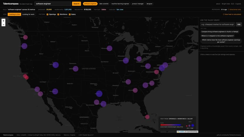
Recruiters and job-seekers ask the same question — "where should I be looking?" — from opposite sides of the same market. TalentCompass answers it visually. Type a job title. The app uses Bright Data's Web Unlocker to scrape live LinkedIn and Indeed results for that title across 25 US metros, triangulates the opening count with Adzuna, and overlays BLS Occupational Employment Statistics so demand is plotted against actual workforce size. The result is a single map you can toggle between "Looking to hire" (red = saturated market, blue = easy hire) and "Looking for work" (red = no jobs, blue = best opportunity). Same data, opposite rankings. Every metro is summarised into a "talent-market snapshot card" and ingested into Cognee, which builds a knowledge graph (Kuzu + LanceDB) over the 25 cards. The chat panel runs graph-completion queries — top_k=50, wide_search_top_k=300 — so questions like "compare Austin and Raleigh for ML engineers" reliably retrieve both cities and let Claude Opus 4.7 synthesise a cited answer. Drill into any metro for sample listings, top employers, median pay and salary distribution. Click between job titles instantly — results are cached in SQLite per (title, metro). A horizontal pill bar aggregates the top employers across all loaded metros. Built on FastAPI + React, deployed to AWS ECS Fargate + EFS + CloudFront via Terraform and GitHub Actions OIDC. Source: github.com/duality72/talentcompass. Live: talentcompass.dctank.com.
31 May 2026

